Follow the links below to find helpful information on several important topics.
2. Reports sent in last week
- On the right, you
will find a listing of Reports that were released over
the past week. Click on a particular market to bring up the
Dashboard window for that particular market.
3. Drive Schedule Status
- In the top center
of the home page, you will find a map showing the
weekly status of the GWS Drive Schedule. Click on this map
for a larger view, more details of each market, and an
export of the full schedule.
4. National Trending Charts
- Below the schedule map, you will find a graph of
the National Reliability Trend as well as the National Overall Throughput
Trend (HTTP DL Large from Request). This shows a quick snapshot of
the Reliability and Overall Throughput values for all markets (pop-weighted)
over past campaigns. Click on these snapshots to go to the detailed report where you
can change the parameters for these plots.
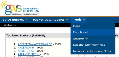
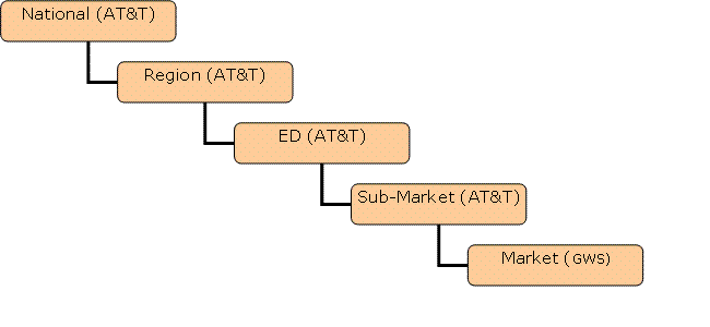
Dashboard is a feature under the special tab that provides a
quick, customizable, and consolidated view of a market's voice and
packet data charts and tables. The Region,
Market, and/or Submarket that automatically comes up as well as specific
charts and tables may be tailored to the your preference by modifying
the Preferences tab.
A screen that appears like the one below will come up the first time you
use the feature.
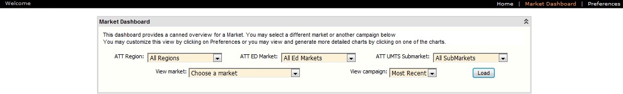
Enter Region, Market, ED market, UMTS Submarket, and Campaign as desired
as in the example below; the dashboard charts will come up.
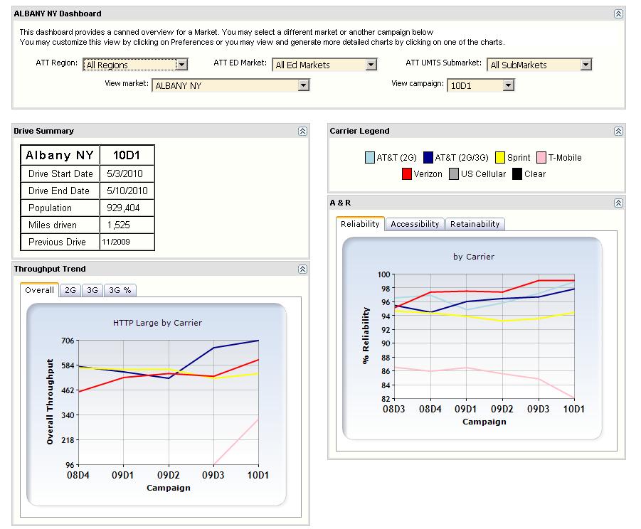
Specific charts and tables may be hidden if desired by clicking on the double
arrow in the upper right-hand corner of each chart/table. You can
click on any of the charts to move to the more detailed report for that
specific chart.
Preferences[top]
To customize the dashboard to your specific needs,
select the "Preferences" tab in the upper right-hand corner
of the screen. Once customized, the dashboard will always come up with the
market and charts/tables specified in the Preferences. Individual charts
may even be tailored for single or multiple view.
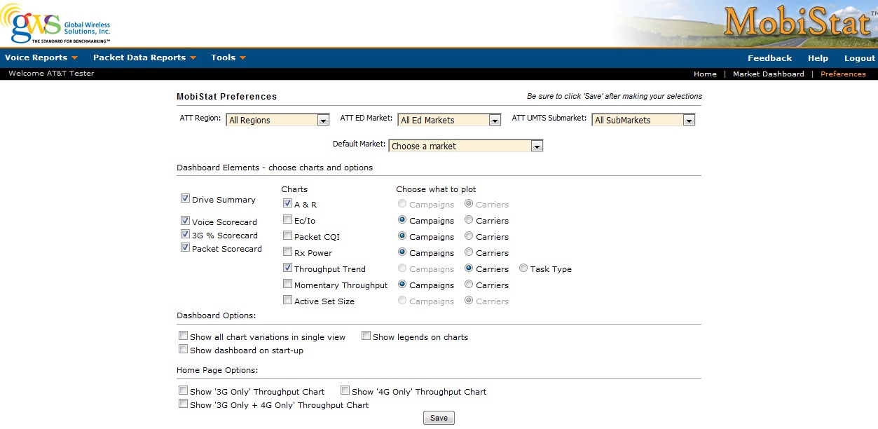
Dashboard Elements - There are a number of elements
that can be turned on and off on the dashboard depending
on your specific preferences. Some charts allow you to plot a specific
carrier for multiple campaigns as opposed to plotting all of the carriers for
the chosen campaign. This option is available in the "Choose what to plot"
section.
Dashboard Options - There are currently three special
options to choose from for your dashboard. These can be found under "Dashboard
Options" as seen above.
-
Show all chart variations in single view
- For all the charts chosen in the preferences section, this will
automatically show all variations for each chart all the time. For example,
rather than just having different tabs for the Throughput Trend chart to show
2G only throughput vs. 3G only throughput vs. Overall throughput, this would
show all three at once in three different charts. This causes a lot more
charts to show at once, but might make it easier for you to view.
-
Show legends on charts - This provides the option
to show the legend individually on every chart as opposed to only once on
the whole page. This makes the chart more crowded, but less moving back and
forth to see the legend.
-
Show dashboard on startup - This will allow you to automatically
go to the dashboard as soon as you log into MobiStat.
Home Page Options - This section allows you to
choose the type of Packet Data chart to show on the home page.
Inactivity Timeout Warning and Refresh
Option
MobiStat will now provide a warning that the current
session is getting ready to expire due to inactivity and will let you
refresh the session if so desired. The current inactivity timer is set to one
hour and the warning will pop-up 2 minutes before the hour.
Maintenance
GWS will be
performing weekly updates to the servers on Saturday mornings around 9am
EST. This will include a server reboot so servers
might be temporarily unavailable during this
time.
Voice Reports [top]
A&R Voice Charts[top]
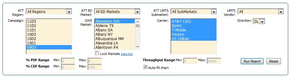
Market Filtering
Every chart can be filtered by geographic regions.
To run the A&R Chart, select a region, campaign,
ED market, GWS market, UMTS submarket, Carrier, and UMTS Vendor. You can keep
your market selections while changing campaigns if you click the "Lock Markets" box under the GWS Market
menu.
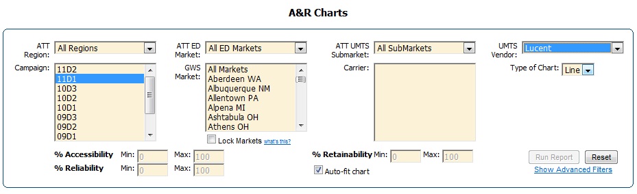
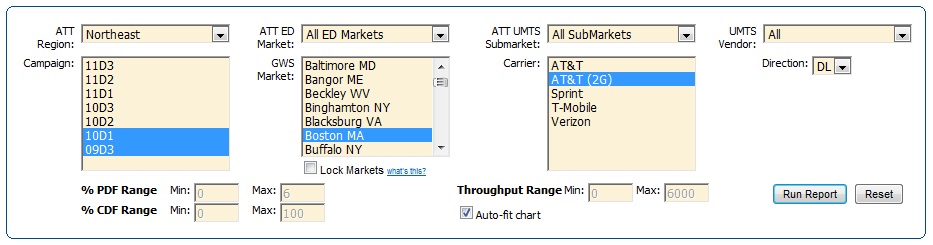
"UMTS Vendor" Filter for Charts -
The "UMTS Vendor" filter allows for the filtering of
the market list based on the UMTS provider. The
"All" selection turns the filter off, displaying all markets; however, either Ericsson
or Lucent may be selected individually. The UMTS Vendor filter is
available for all voice and packet data charts. The example below shows
the filter use for an A&R voice chart.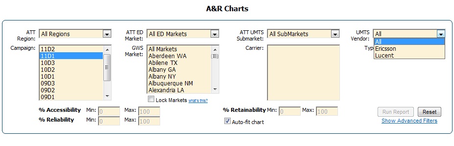
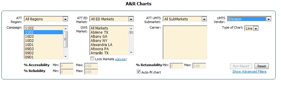
Note the differences in the GWS Markets listing
in the following two examples depending on the UMTS Vendor selection.
The first picture shows Ericsson as the UMTS vendor, and the second shows
Lucent.
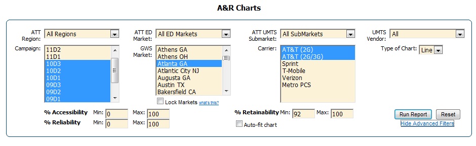
A&R Advanced Filters -
The "Show Advanced Filters" option located under the "Run Report" button
allows you to filter and group data based on a number of
options beyond the basic selection criteria set when generating a normal A
& R Chart or Throughput Trending Chart. The charts produced by
the advanced filters are limited to a maximum of ten lines per chart.
Currently, if more than ten lines would be produced by the options chosen, then
the first ten will show on the chart (based on the sorting of the
group by fields).
To use the "Show Advanced Filters" Option, first fill out the Chart
window selecting regions, markets, campaigns, carriers, etc. for the report as
seen in the example voice A & R Chart below and then select the "Show
Advanced Filters" option.
The advanced filters box will appear.
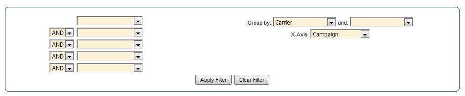
Click on the drop-down arrows to see the filtering options. Below
are filtering options for voice. Note that multiple filtering criteria may be
employed; however, charts are limited to a maximum of ten lines.
The "Group By"
options will define what is shown for each line in the chart. Previously, only
Carrier was used to define each line. The X-axis provides three different options for choices: Campaign, Time
of Day, and Day of the Week. Make your filtering selections, Group
by selections, and determine the X-Axis. Select "Apply Filter."
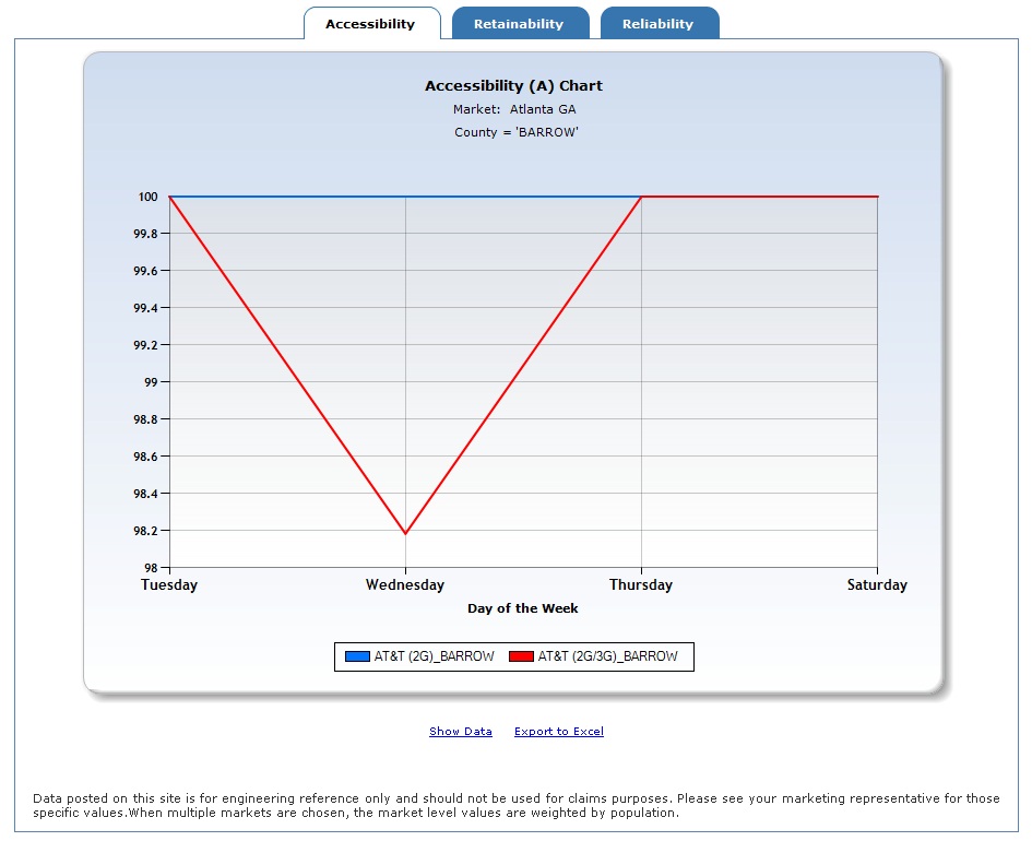
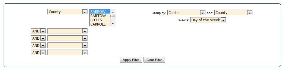
The above chart used the advanced filtering
capability to show Accessibility results for each carrier on one day
(Monday) in Atlanta for each campaign. Using the "Export to Excel" link below
the chart, you can see the actual values that make up the chart.
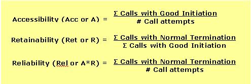
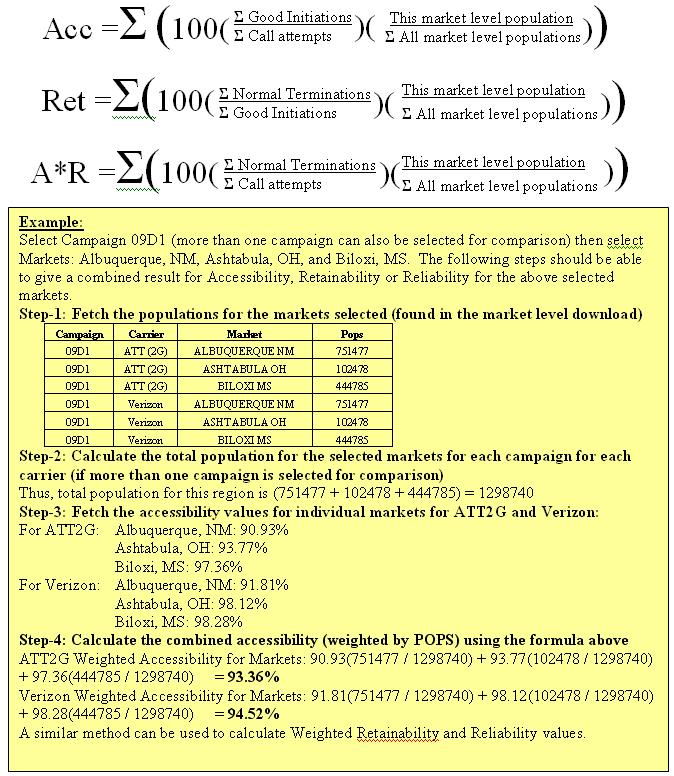
A&R
formulas [top]
The basic formulas for A&R are as follows:
Weighting by Population
[top]
The biggest problem with this formula is that it does
not take the population of a market into consideration. When averaging out the
markets within a region, one market may have a larger population than
another. So, the A&R report should reflect the population bias when
presenting the data.
These two charts show the difference between a weighted and non-weighted A&R snapshot.
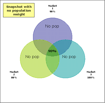
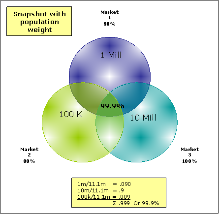
The equation used for pop weighting the market-level A&R values is shown
below:
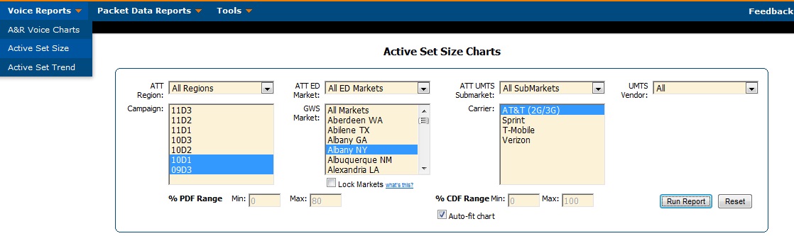
Active Set Size Charts
[top]
The Active Set Size chart shows Active Set Size PDFs
and CDFs for each carrier. You can find the Active Set Size chart option under
Voice Reports >> Active Set Size as shown below.
A sample Active Set Size Chart is below:
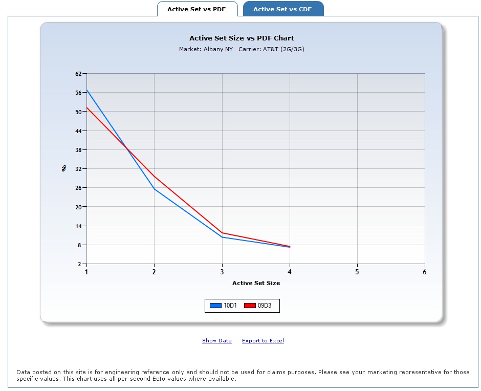
The Active Set Size CDF chart may be viewed
by selecting the appropriate tab in
MobiStat. This chart can be used to show different campaigns for one carrier
(as shown above) or multiple carriers for one campaign.
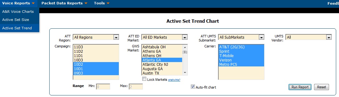
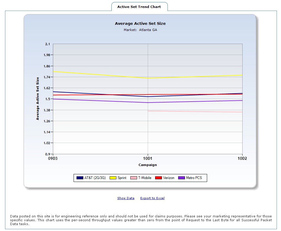
Active Set Size Trending[top]
The Active Set Size Trending chart shows the Average
Active Set Size in the market per drive for multiple carriers.
To run an Active Set Trend chart, select
Voice Reports >> Active Set Trend as shown below.
A sample Active Set Trend Chart is below:
Packet Data Reports [top]
Distribution
Charts [top]
There are four Packet
Data distribution reports included in MobiStat:
- Momentary Throughput PDF/CDF Charts
- Provides distribution charts of momentary (per-second) throughputs
for a given market for all successful tasks.
- CQI
Charts
- CQI PDF/CDF Charts - Provides
distribution charts of mean per-second CQI scores for a given market for
all successful tasks.
- CQI versus Throughput Chart -
Provides a comparison of the mean per-second CQI score against the average
momentary throughput. This only uses values from successful tasks where
the throughput is greater than zero.
- Composite Ec/Io Charts
- Ec/Io PDF/CDF Charts -
Provides distribution charts of the per-second Ec/Io values for a
given market.
- Ec/Io versus Throughput
Chart - Provides a comparison of the per-second Ec/Io
values against the average momentary throughput. This only uses
values from successful tasks where the throughput is greater than
zero.
- Composite RxPower Charts
- RxPower PDF/CDF Charts -
Provides distribution charts of the per-second RxPower values
for a given market.
- RxPower versus Throughput
Chart - Provides a comparison of the per-second RxPower
values against the average momentary throughput. This only uses
values from successful tasks where the throughput is greater than
zero.
The filters give you the option to
view multiple data sets at once; however, only one of the three filters
(i.e., Campaign, Market, and Carrier) can have multiple selections at
a time. For example, you can select multiple carriers, but then you can
only seelct one campaign and one market. Note that there is a 10 market
maximum. The example below shows selections for a multiple carrier
chart.
The following example shows selections for a multiple
campaign report with only one carrier's results to be charted:
Once all selections have been made, click on "Run
Report" to generate the Chart.
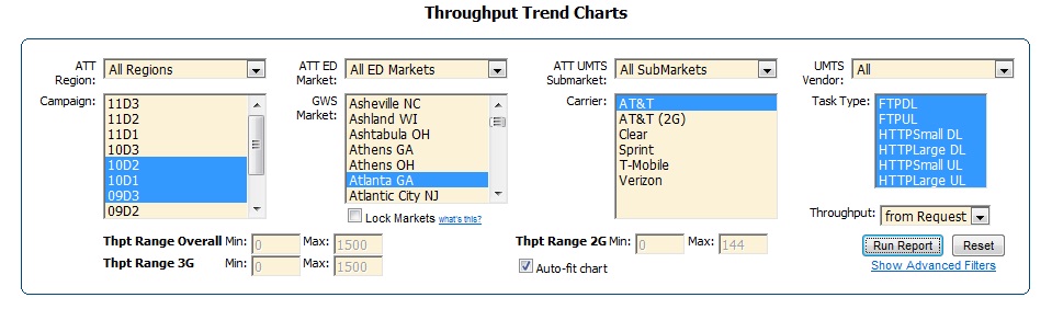
Throughput Trend
Charts [top]
Throughput Trend Charts show the throughput values
for each task type (i.e., FTPDL, FTPUL, HTTPSmall DL, HTTPLarge DL,
HTTPSmall UL, and HTTPLarge UL). When multiple markets are chosen the values
are weighted by population (details discussed in the Weighting section). This report will
provide five different views into the throughput values:
-
Throughput Application Mean (2G) - This is
the Harmonic mean of throughput values for only tasks that were 100% in 2G
mode (i.e., EDGE, GPRS, or 1xRTT).
-
Throughput Application Mean (3G) - This
is the Harmonic mean of throughput values for only tasks that were 100%in 3G
mode (i.e., UMTS, HSPA, HSPA+, EVDO, or EVDORevA).
-
Throughput Application Mean (4G) - This is
the Harmonic mean of throughput values for only tasks that were 100% in 4G
mode (i.e., dual carrier HSPA+, Wimax, or LTE).
-
Overall Application Mean- This is the Harmonic
mean of throughput values for all tasks regardless of 2G/3G mode.
-
3G/4G % -
This is the average percentage of 3G and 4G for each carrier in the
market(s).
Regardless of which option you choose, these
values should not be used for claims purposes.
Please see your marketing representative for those specific values.
The Throughput selection option allows you to choose if you want all results (both
HTTP and FTP tasks) to be calculated from first byte or
from request. Throughput calculations based on "From Request"
measure throughput from the time the request was sent until the time the last
byte was received. Throughput calculations computed "From 1st Byte" measure throughput from the time
the first byte was sent until the time the last byte was
received. Once a report is generated selecting throughput "from request,"
its results can then easily be changed to "from 1st byte"
calculation by selecting that type of throughput calculation and
vice-versa. You can also select your desired UMTS vendor from the UMTS Vendor
drop-down menu.
By selecting multiple campaigns, you can trend
packet data results over multiple campaigns. It is located
under the Packet Data Reports Menu. Packet Data may be trended
across campaigns to show multiple carriers for an
individual task type or to show multiple task types for an individual
carrier. If you select multiple markets, the Harmonic Pop-Weighted Mean
will be used to combine the values. The following example depicts
throughputs from one task type for six carriers trended
over multiple campaigns:
You must fill out your selections: Drive Num,
Campaign, Sub Market, Market, Region, Carrier, Ed Market. Then, select
how you want the Throughput to be calculated: from Request or from
1st Byte. Finally, click "Run Report" to generate the
charts. A sample chart is shown below:
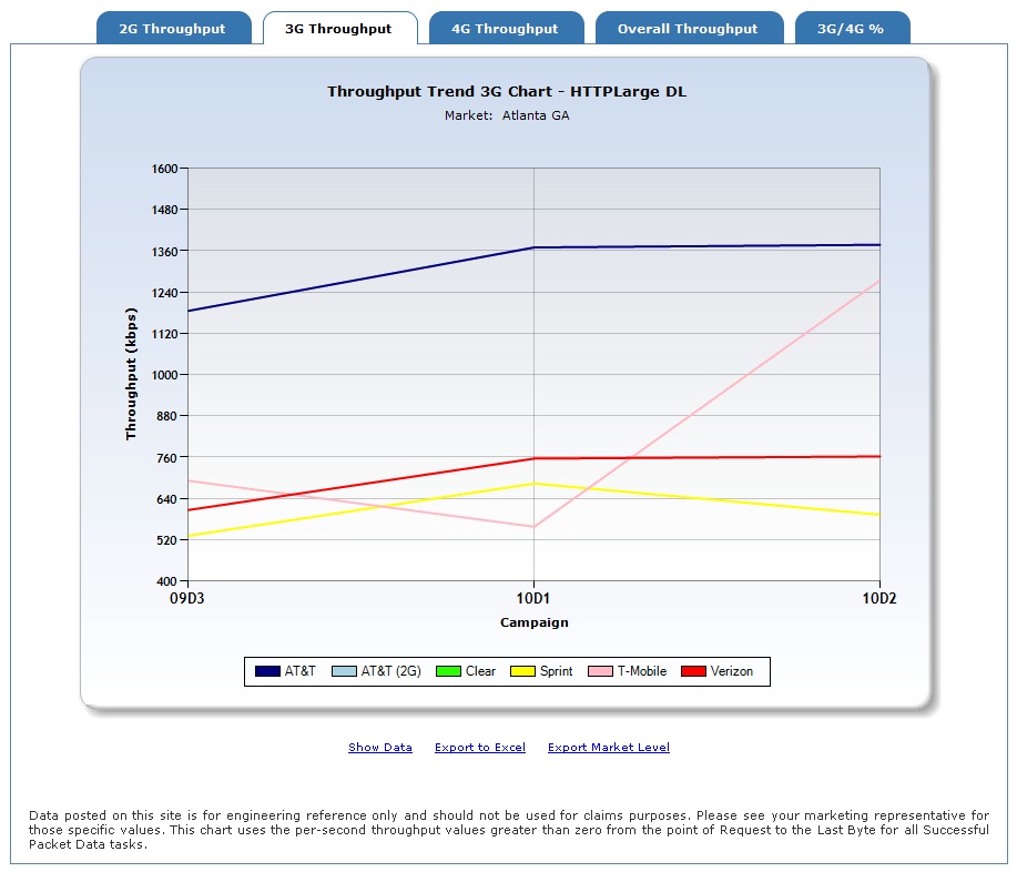
Results may be seen for 2G, 3G, 4G, Overall
Throughput, or 3G/4G% by clicking on the corresponding tab for each
report within MobiStat.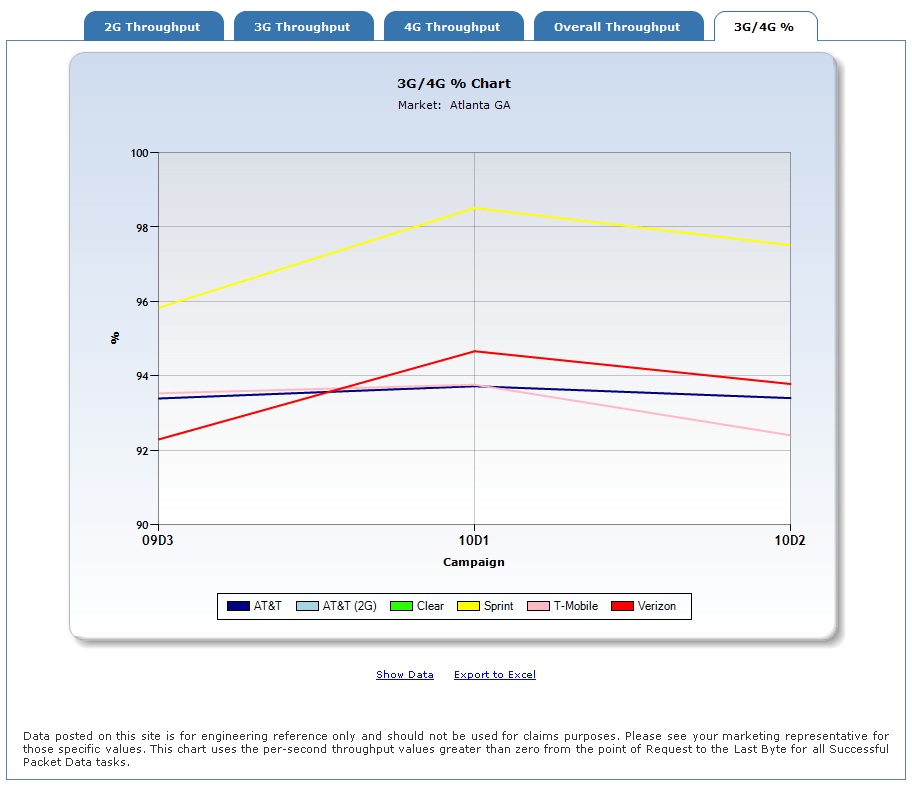
The following example depicts throughputs
from one carrier for all four task types trended
over multiple campaigns:
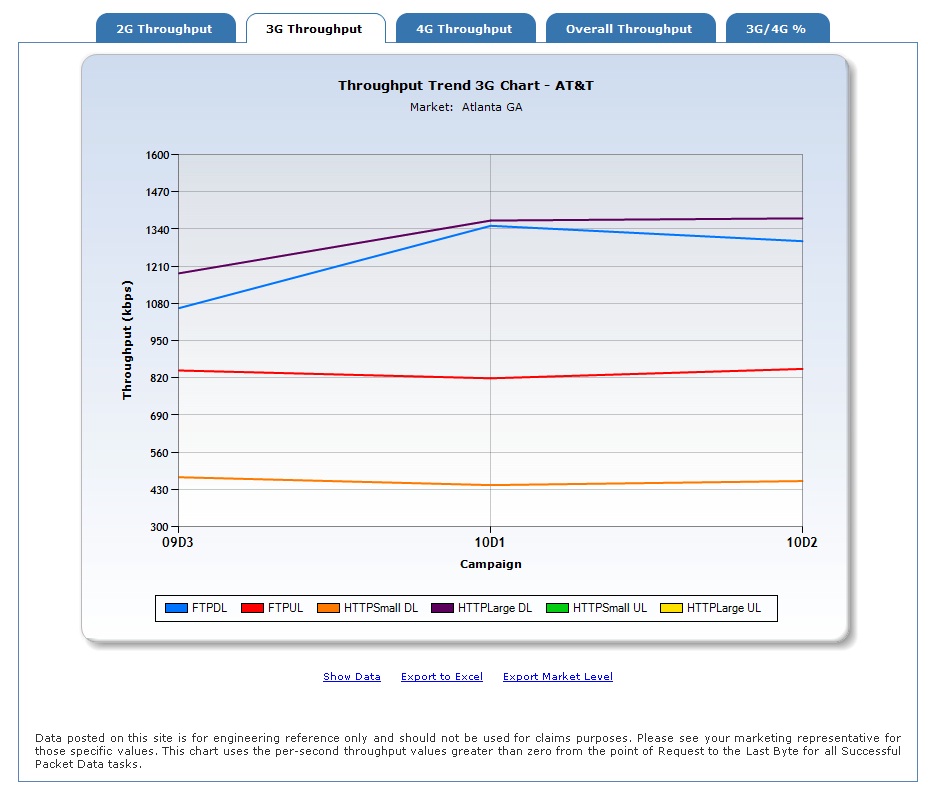
Detailed market-level throughput values may
be downloaded for each report run by clicking on the "Export Market
Level" link below each report. Selecting the "Export to Excel" link will
provide an export of the rolled up values if multiple markets are chosen.
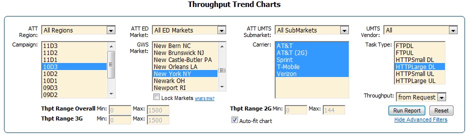
Throughput Advanced Filters - Below the "Run
Report" button on the Throughput Trend Charts is an option to include some
Advanced Filters. This provides the option to filter the selected data
as well as choose different options for the x-axis in the charts. The selections and chart below show a sample Packet
Data Throughput Trend Chart with advanced filtering:
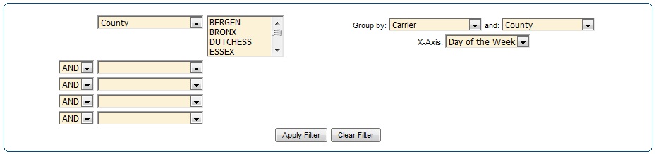
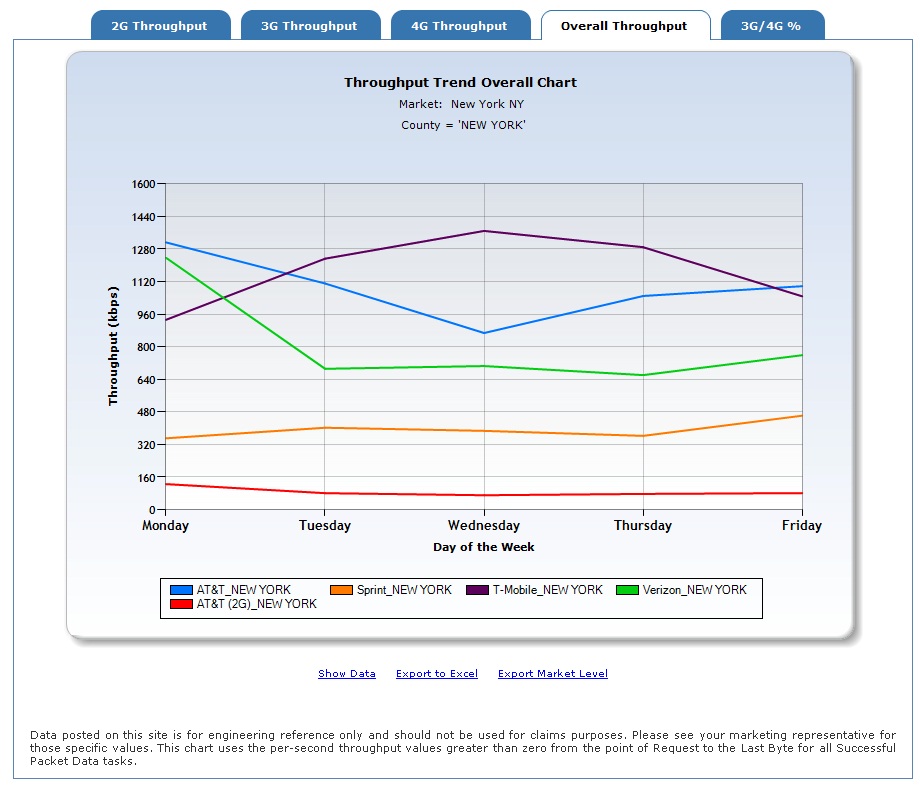
The above Throughput Trend Chart results
were drilled-down through Advanced Filtering to show only New York, NY county,
and were grouped by carrier. Day of the week was chosen for
the X-axis. Advanced Filtering drilled-down the data from the broader
specifications entered into the Throughput Trend Chart selections.
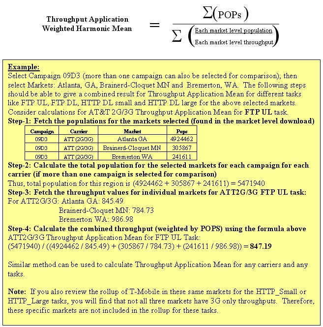
Weighting Throughput by Population
[top]
Since throughput is
a rate and the markets should be pop weighted, the Weighted Harmonic
Mean equation should be used instead of the Weighted Arithmetic Mean equation,
which is used for Voice stats. The Weighted Harmonic Mean equation is only used
when more than one market is selected using the Summary Throughput Report. The
equation used for pop weighting the market-level Throughput values is shown
below:
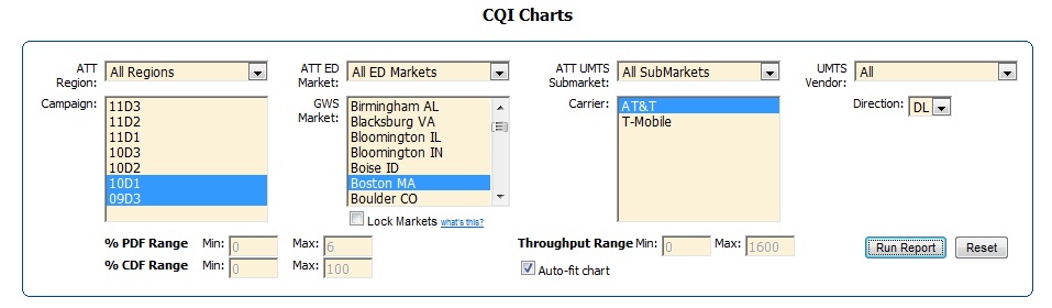
CQI Charts [top]
The CQI selection filters appear as below. Note
that the CQI chart has a filter for direction (i.e., Downlink or Uplink)
as well.
An example of the CQI vs. Throughput Chart
is shown for the above options:
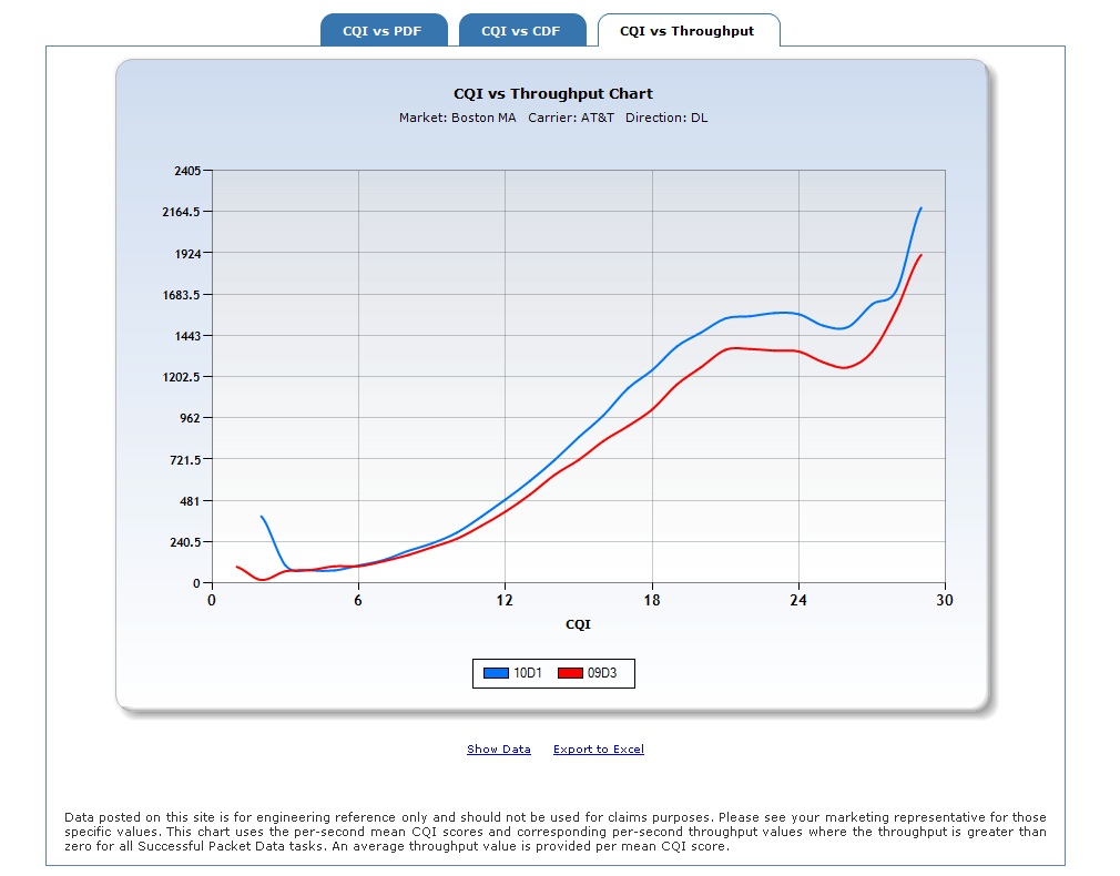
To view data from any of the charts, click "Show Data"
at the bottom of the chart. The data can also be exported to Excel by clicking
on the "Export to Excel" link. The filters also provide a way to change
the y-axis scale as desired by updating the values shown based on the specific
chart and re-selecting the "Run Report" button.
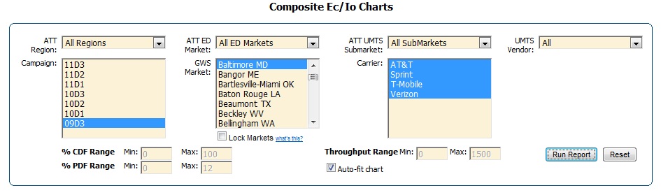
Ec/Io Charts [top]
The selections for the Composite Ec/Io Charts appears
as below:
An example of the Ec/Io CDF Chart is shown
for the above options:
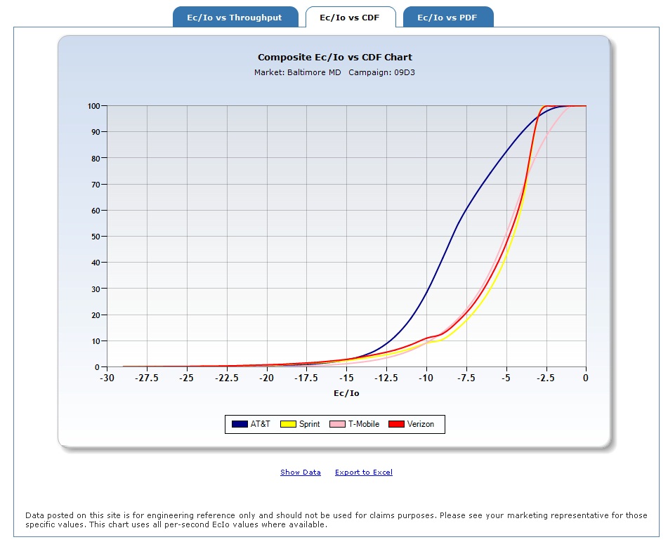
To view data from any of the charts, click "Show
Data" at the bottom of the chart. The data can also be exported to Excel by
clicking on the "Export to Excel" link. The filters also allow you to change the
y-axis scale by updating the values shown based on the specific chart
and re-selecting the "Run Report" button.
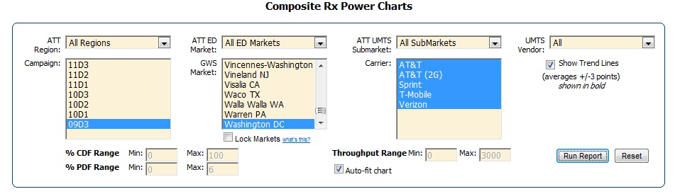
Composite RxPower Charts
[top]
The options for the Composite RxPower Charts appear as
follows. Note that this includes an option to show an average trend line
for the RxPower vs. Throughput charts. You can turn this off by unchecking the
"Show Trend Lines" box.
An example of the RxPower vs. Throughput Chart is
shown below:
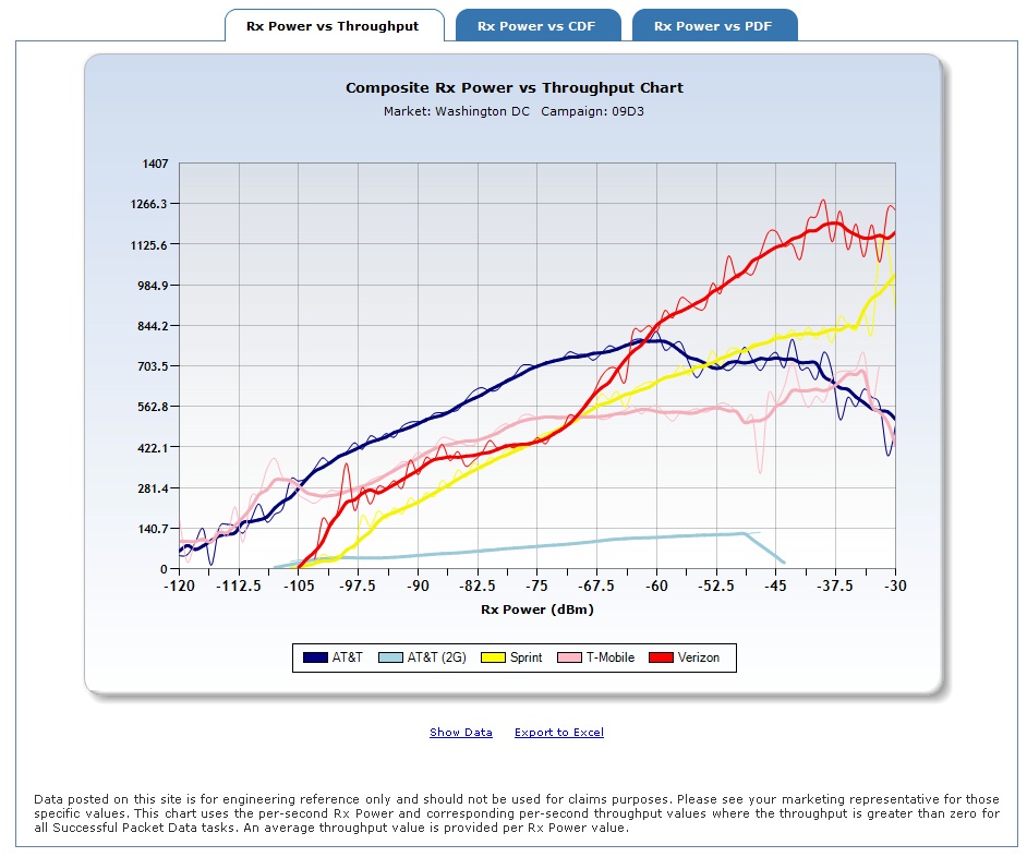
To view data from any of the charts, click "Show
Data" at the bottom of the chart. The data can also be exported to Excel
by clicking on the "Export to Excel" link. The filters also allow
you to change the y-axis scale by updating the values shown based on the
specific chart and re-selecting the "Run Report" button.
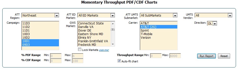
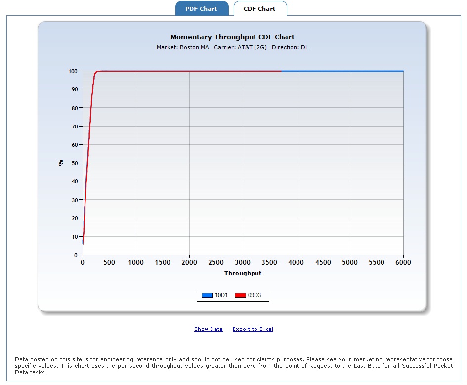
Momentary Throughput PDF/CDF Charts
[top]
The Momentary Throughput PDF/CDF Charts for Packet
Data filters appear as below. Note that the Throughput chart has a filter
for direction (i.e., Downlink or Uplink) as well.
The PDF Chart generated from the above selections by
clicking "Run Report" is below:
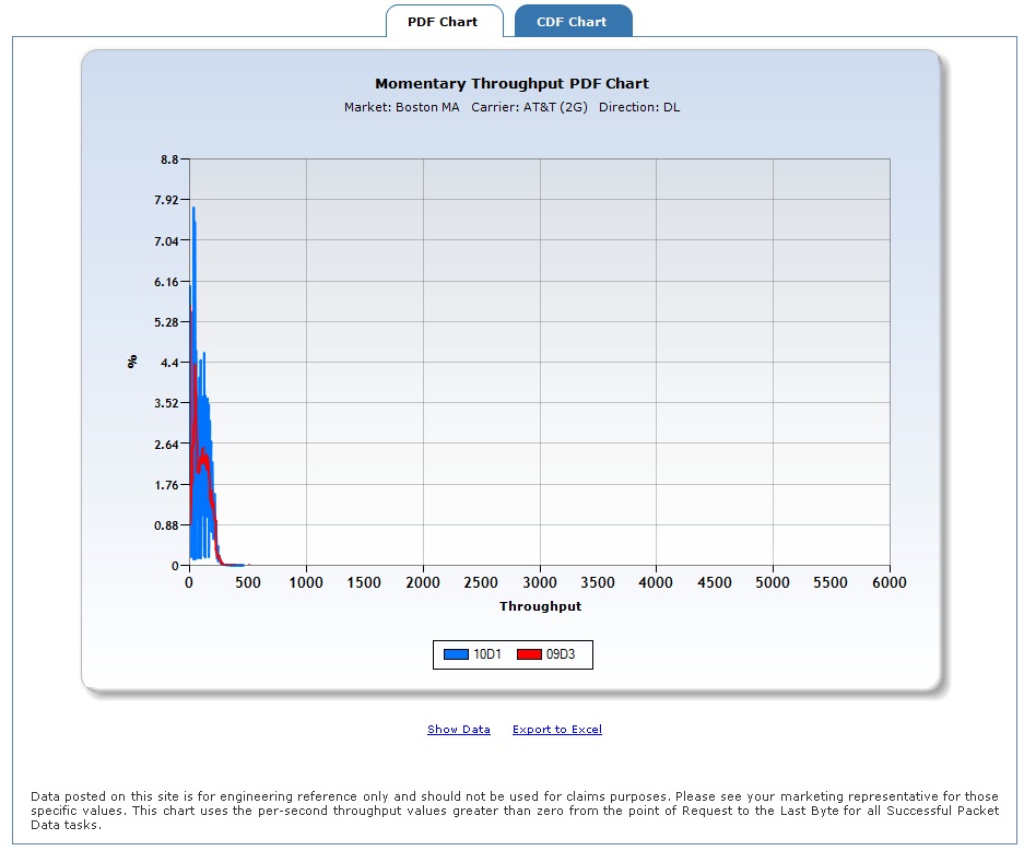
To see the data that composes the report, click on
"Show Data." The data can also be exported to Excel by clicking on the
"Export to Excel" link. The filters also provide a way to change the
y-axis scale as desired simply by updating the values shown based on the
specific chart and re-selecting the "Run Report" button.
To view the CDF Chart, simply click on the CDF tab;
the report will generate as shown below.
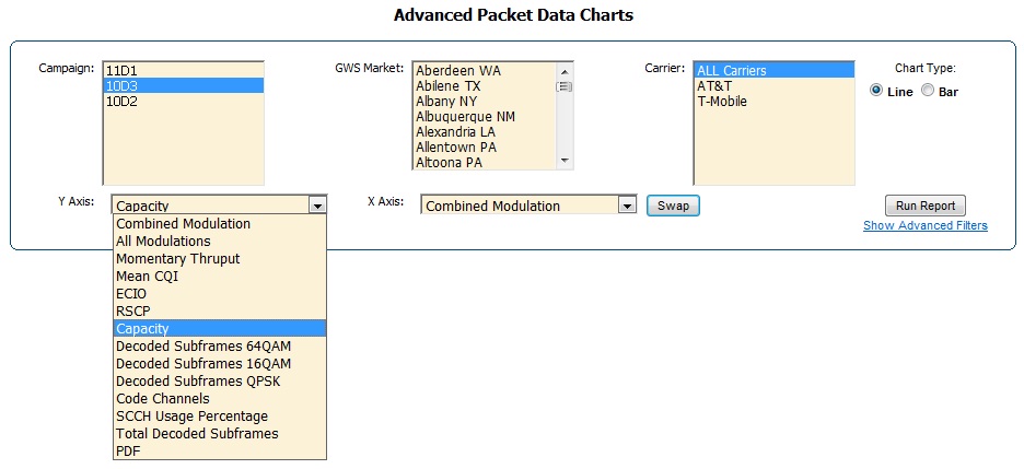
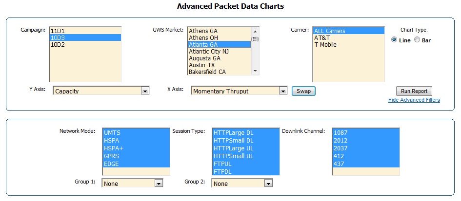
Advanced Packet Data Charts[top]
The Advanced Packet Data Charts use per-second Packet
Data to generate charts to analyze and compare numerous metrics. They
offer you the flexibility to choose the X and Y Axis. These charts also offer
an advanced filtering option. Note that these charts are only
available for AT&T (2G/3G) and T-Mobile.
The "All Modulations"
field is specific to the y-axis and shows all three modulation options
(i.e., QPSK, 16 QAM, and 64 QAM) all in
one chart, but as individual lines.
The "Combined Modulation" field represents the average
modulation all in one value. For each second, GWS recieves the number of
decoded subframes that use each modulation type. Since QPSK = 2
bits/symbol, 16 QAM =
4 bits/symbol, and 64 QAM =
6 bits/symbol. GWS can
then use the percentage
values combined with the bits/symbol values to get
a single equivalent modulation value. < /p > <
p >
For example, say at a given second, 100 decoded subframes
used QPSK and 100 used 16 QAM. This means that the equivalent combined modulation
value would be (100*2 + 100*4)/200 =
3 bits/symbol, which is halfway between QPSK
and 16 QAM. This is not a real number, but more of a
representative value that describes the amount and type
of modulation used during that second.
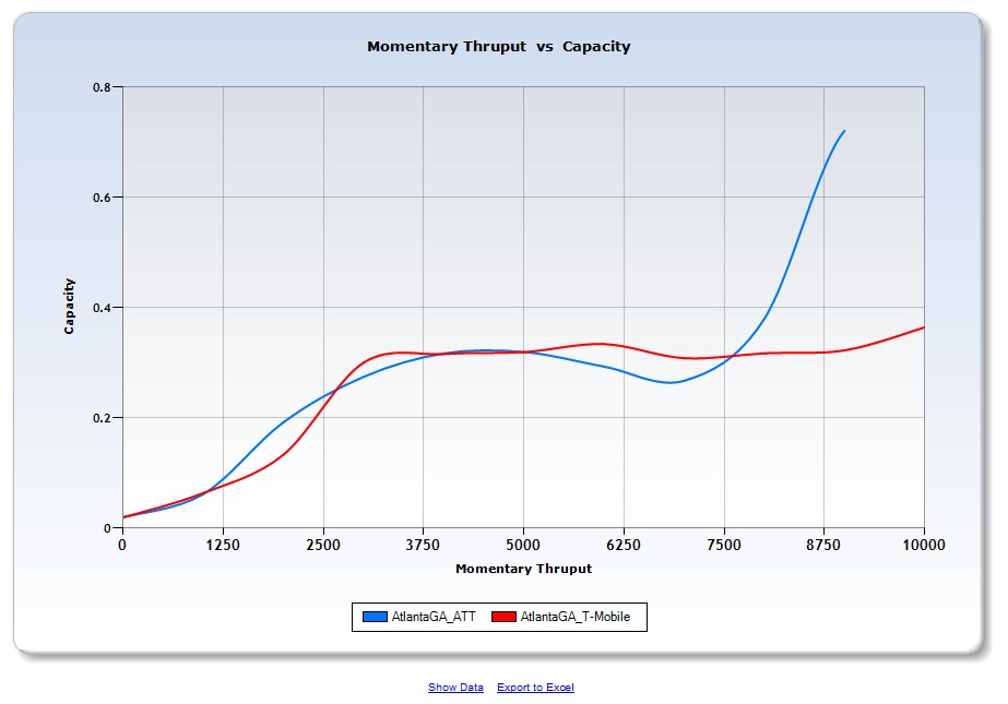
The "Capacity" field represents
a combination of the Code Channels and SCCH
Usage Percentage fields, which are both needed to represent the current loading of the network. This allows you
to plot one value instead of two. For each second, GWS recieves the
average number of code channels used (ranging from 1-15) when 1 or
more code channels were used. However, this average alone does not describe how long
those code channels were available. So, GWS also recieves the percentage of time (TTIs) that one or
more code channels were used. This is combined with the average code channels to show
a total capacity/loading value. More specifically, the average
code channels are divided by 15 (total channels available) and multiplied by
the SCCH Usage Percentage to arrive at one value. For example, if the
average code channels used is 10 and the SCCH Usage Percentage is 30%, then the
capacity value is (10/15)*0.3 =
20%.
This value means nothing by itself, but can be viewed relative to
the same value for other variables like different
times of day or another carriers network.
Select which metric to
compare on the Y and X Axes. Note that
the Y-axis values are typically averages with the exception of
the "PDF" option, which is a count/percentage. Note that the "All Modulations"
and "PDF" options are Y-axis specific and "TimeStamp (Hrs)"
and "TimeStamp (Days)" are X-axis specific.
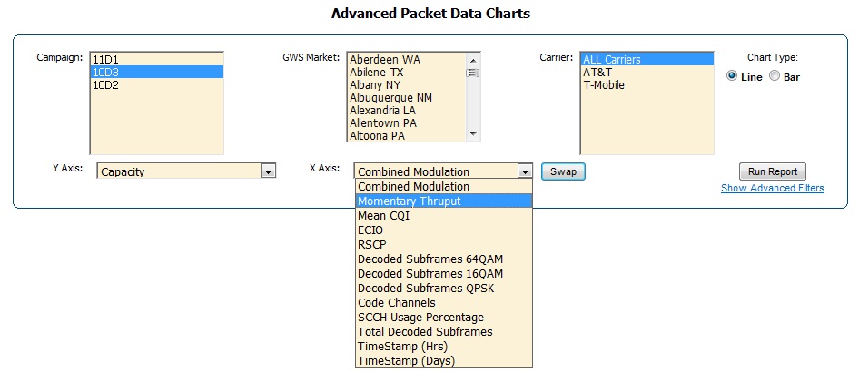
The "Swap"
button allows you
to switch the X and Y Axis metrics. Currently,
there are only three advanced filter options: Network Mode, Session
Tyype and Downlink Channel. Once you have made your selections and set up the
advanced filtering as desired, click "Run Report" to
generate the chart as seen below.
Tools
[top]
Maps[top]
Mapping Layout and Features
MobiStat's mapping capability has several features including the ability to display
per-second data such as Rx Power, Rx Qual, Mos_DL, Mos_UL, and Band for a carrier in
a specific market. The new map layout opens to the
"Layers" tab (shown at the top in the yellow box) with Layers options to the
right of the map as seen below. Two options exist for mapping: Market
Selector and Rubber Band.
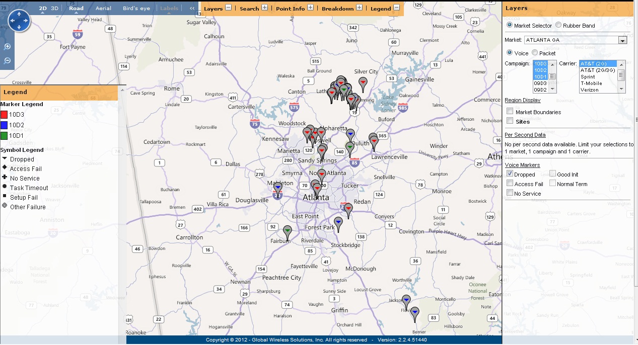
Market Selector Method
The "Market Selector" option allows you to view a
specific market from a provided list of tested markets. The data can be shown
for either Voice or Packet Data. In the example below, a market (Atlanta, GA), three campaigns
(10D3, 10D2, 10D1), and one carrier (AT&T (2G)) were selected along with
the Dropped Voice calls for each. If desired, the market boundaries can be turned on
using the checkbox under the Region Display.
Clicking on
a specific failure will provide a high-level view into the details of the chosen
call.
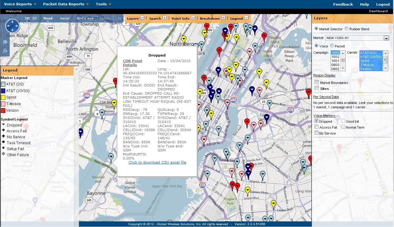
You can also select multiple markets and one campaign.
The following map shows AT&T(2G), AT&T(2G/3G), Sprint, T-Mobile, and
Verizon call drops in New York, NY, during the 10D3 campaign. Each marker is
color-coded by carrier as shown in the Legend. You can hover over a single
marker to see details about that particular event.
Inside of the summary list, there is an option to
download the per-second data around each call by using the "Click to download
CSV excel file". This option uses Excel to show many more details of that call
for further research. (The per-second option is currently only available for AT&T calls.) This download will
provide all the details of the specific call along
with the per-second data + 5 minutes around the call. Directly underneath the call
record in row 3 of the spreadsheet is a link that will take you
back to the map for this particular call.
To view the legend,
click on the "+" beside the word Legend in the yellow bar across the top
of the map. To remove it, click on the "-". The same is true for Layers,
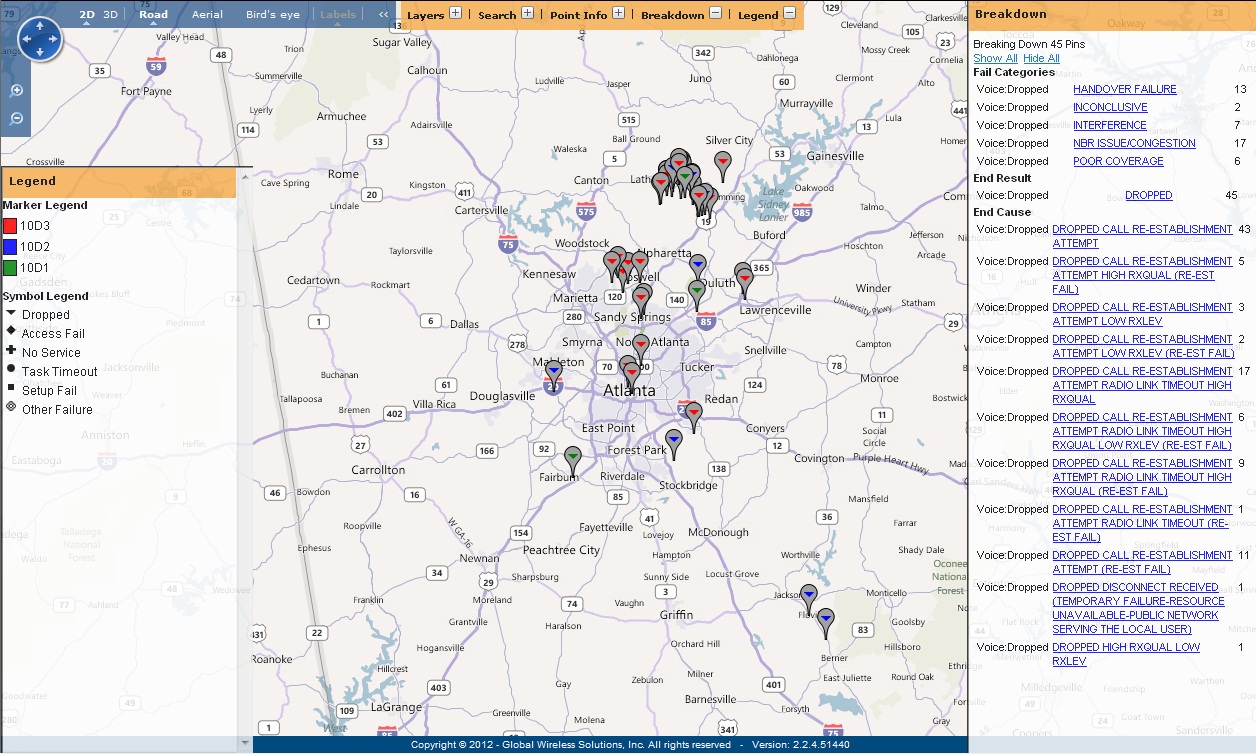
Point Info, and Breakdown. The Breakdown section provides a detailed
breakdown of the failures for the carrier and campaign selected in
the Layers section. It also provides a count of each failure type. Note,
if multiple campaigns or carriers are chosen in the Layers section, then
the count would reflect all of them together. The image below shows the
breakdown of the displayed dropped calls.
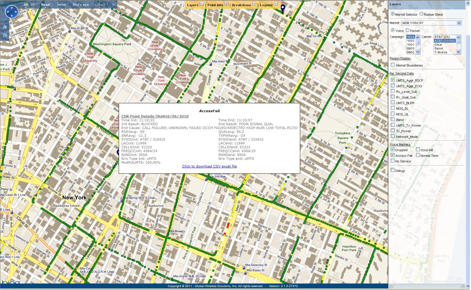
Per-second Data
You can
also view the detailed per-second data in the map. To view per-second data,
you must limit your selections to one market, one campaign, and one carrier at
a time. In the Layers section to the right of the map is a sub-section
for "Per Second Data. This provides a
number of different parameters that can be shown within the map. Simply select
the checkbox of the parameter that is to be shown. Per-second data is only
available on a market basis starting with 10D2 data and is not available when
using the
rubber band
method. CDR Point Details may still
be displayed by hovering your mouse over each individual
call exception as shown below in the map.
If you click on an individual point, "Point Info" will
automatically display the details behind each point on the bar to the right. The
"Point Info" provides point information of data if data exists at that location
within the selected market or rubber band even if it is not currently
displayed on the map. The map below shows an example of
the Aggregate RSCP per-second values for the AT&T (2G/3G) device along
with an Access Failure in New York City.
Aerial View for Bing Maps
- You can also view the same maps using Bing's satelitte imagery. The
standard buttons have been turned on in the upper right corner of the map so that
you can toggle between the standard maps view versus the satellite view.
Maps may be viewed in 2D or 3D and may be shown
in "Road," "Aerial," or "Bird's Eye" view by clicking on the words in blue
on the top-left corner of the map. The above map is shown in 2D-Road
view. The map below is shown in 2D-Aerial.
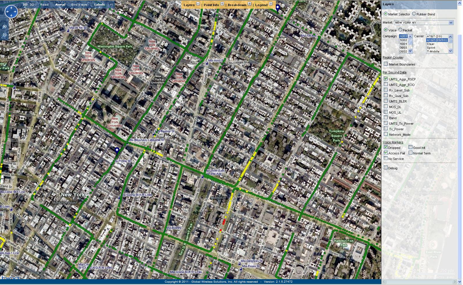
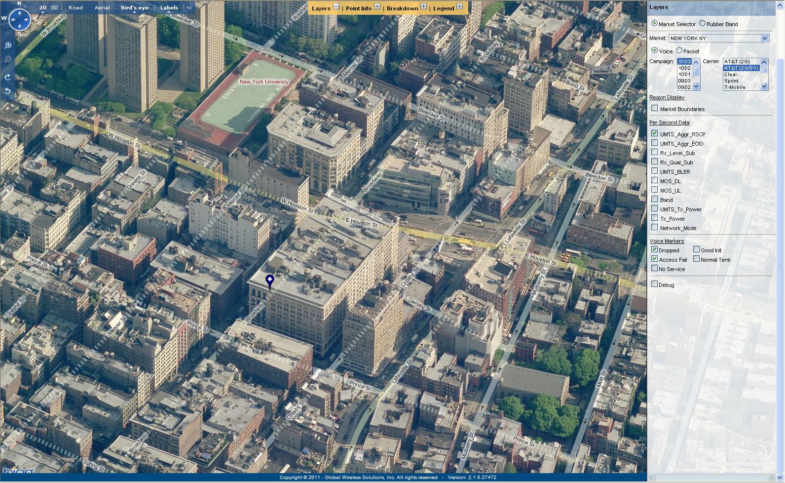
The next map shows the
same dropped call but in the 2D-Bird's Eye view. The Call Failures can be
shown in the Bird's Eye View; however, the per-second data does not show in
this view.
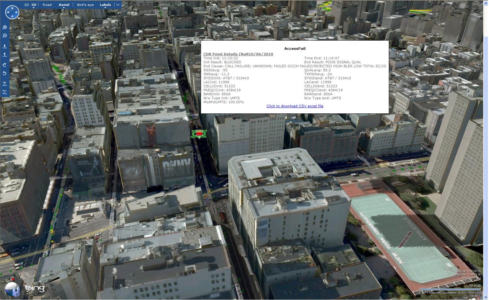
The following map
depicts a 3D-Aerial view of New York City with per-second and call failure data
for an even more realistic view of the data. Note, as opposed to the
previous 2D views, the 3D view can change rotation so that you can see the failure
from different angles. The compass is shown in the upper left-hand
corner. Bing Maps must be
downloaded to view maps in 3D.
Search
You can also
use the Search feature to search for a specific state, city, set
of coordinates, or landmark on the map. Click on the "+" next
to the "Search" tab at the top of the map to access this
feature. You can also select the zoom level from 1 (farthest out) to 17
(closest in); the search will take you to the center point of whatever location you
enter.
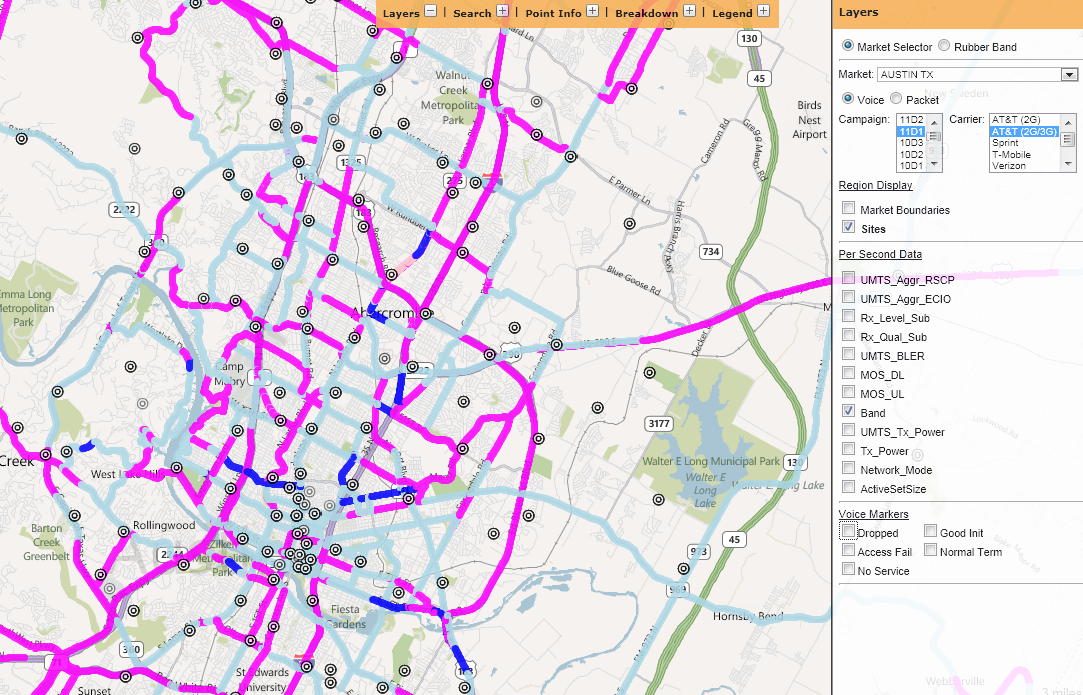
New
Mapping Option to Show AT&T Sites
M obiStat's maps include an option to
view AT&T sites on the map. AT&T provides the
site list, which will be updated with each campaign. The "Sites" option appears under the Market
Boundaries, and the sites are shown on the map as concentric
circles. The following example shows the sites in Austin, TX, for the
11D1 campaign.
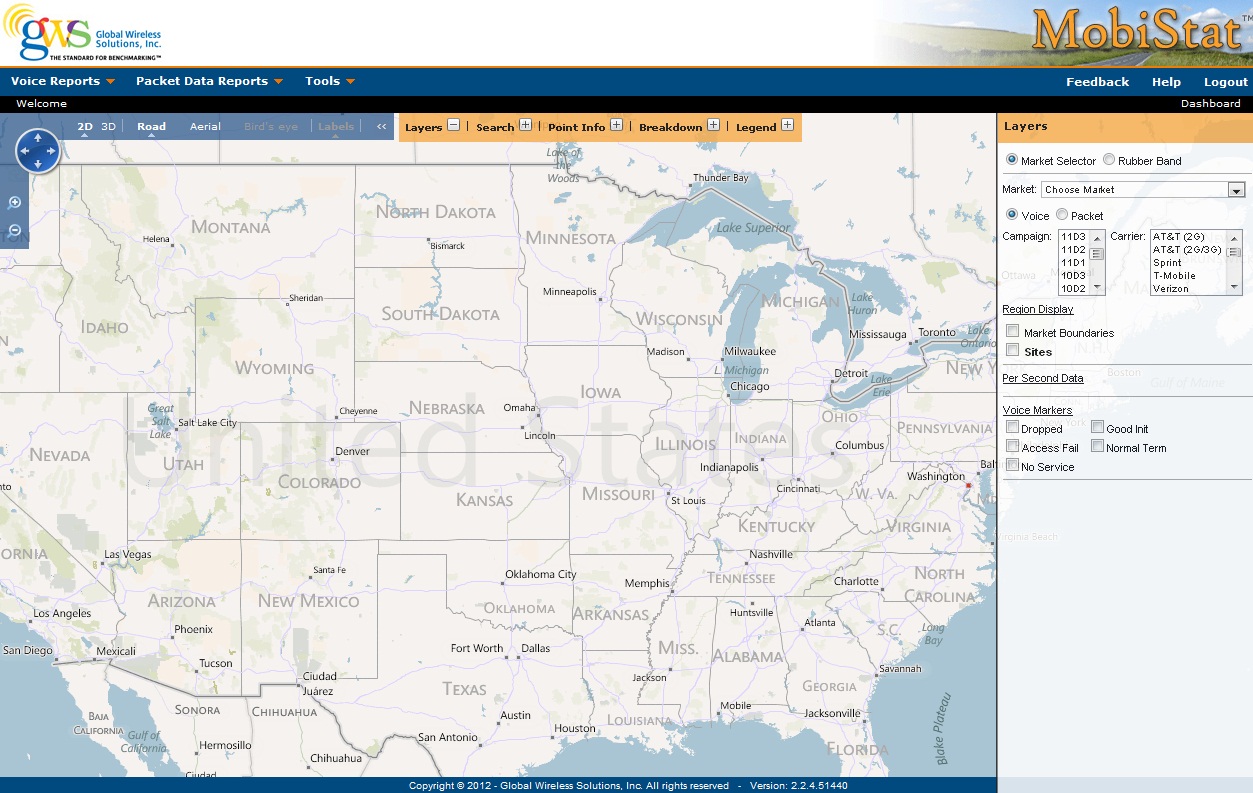
The National Summary Map option under Tools offers a new
way to view the data on a National scale with three different options for data
type: Voice Map, Packet Data Map and Drive Schedule
Map. The following image shows how to navigate to the
National Summary Map.
When you click on a specific market, the value of all
the carriers in that market is displayed sorted from highest to lowest.
Click the column header to re-order the data.
If "Range by Carrier" is selected, the map will show
a particular carrier's performance in each market color-coded according
to performance thresholds. The default thresholds show excellent as green
(75% of max for the carrier), good as blue (60-75% of max), OK as yellow
(45-60% of max), and poor as red (< 45% of max). AT&T (2G/3G)
is the default carrier, but any carrier may be selected from the drop-down
list.
Thresholds may be modified by clicking the "Use
Custom Range" box and entering new values. Once these values are chosen, they
will hold for all carriers and all metrics chosen. The default values
will return if the box is unchecked.
Individual results may be viewed by clicking on a
particular market as seen below.
Moving the cursor over a market
will show you the market's name. The drive schedule data may be exported to
Excel by clicking on "Export to Excel" at the bottom of the screen. The
drive schedule information is updated weekly; therefore, the details displayed
in the map are current as of the date shown on the heading.
To know the details of a specific market simply click
on the market, and it will give you the drive schedule details like Pops,
Miles Driven, Start Date, End Date, and Report Date in a pop-up window as seen
below.
MobiStat includes a section called "Summary
of Network Performance Parameters," which shows the summary stats per market
in tabular form. This also will allow you to compare voice and
packet data to a previous campaign. To view the modified "Summary of Network
Performance Parameters," select "Network Performance Stats" from the "Tools" menu. A listing of markets
will appear as in the sample below: